Choosing Your Brand Colors
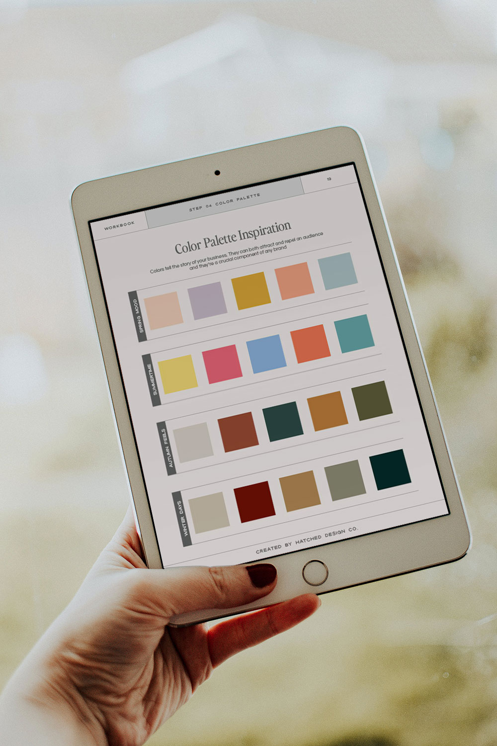
When it comes to building a brand, you gotta give it some personality. And one way to do that is by picking a strategic color palette that will show off your brand’s personality.
Picking your brand color palette is like choosing from a 100 count box of crayons, isn’t it?!
As a professional brand designer, I often feel like I’m picking colors from a box of crayons myself😂
When I’m helping brands choose their colors, for me, it’s all about what kind of emotion you get from the color rather than…picking your favorite color purple.
In this post, we’re going to chat about the how to choose a strategic color palette with the power of colors, getting to know your audience, and why being consistent with your colors are super important.
The Power (and Psychology) of Colors
Just like you’d pick a particular crayon to get a certain feeling across in your artwork, colors in your branding and marketing strategies do the same thing.
For example, red is all about passion, energy, and urgency, while blue is all about trust, loyalty, and wisdom.
So, getting to know the psychology of colors is pretty essential for any brand. Picking the right color can help your brand pop, convey the right vibes, and get the reaction you want from your customers.
Get to Know Your Audience
In order to pick the right brand colors, first you need to get know the kinds of people you want to attract.
Different colors appeal to different folks, like age groups, genders, and cultures… It’s kind of like knowing which crayons a kid would pick from a box.
For instance, if you’re aiming for young adults, bright and energetic colors like warm yellow or a bold blue might be a hit. But, if you’re going for a more mature crowd, you might want to go for more subdued colors like a muted sage green or calming blue.
Doing a little research and understanding your audience’s preferences can really help steer your color choices.
Keep Brand Colors Consistent
Keeping your brand colors consistent is a major part for creating and keeping a brand identity that people will recognize and remember.
Once you’ve picked your brand ‘crayons’, stick with them across everything — Facebook and Instagram posts & templates, Pinterest pins, your email signature, LinkedIn cover image, business cards, course content, I mean the list goes on and on.
Consistency isn’t just about looking slick and professional – it’s also about keeping things real with your audience and helping them trust and remember you!

And there you have it, folks! Picking your brand colors isn’t some big, scary task – it’s as fun and personal as pulling out your favorite crayons for a doodle session.
Dive into the world of color psychology, get to know your audience like they’re your best buddies, and stick to your color choices like they’re your favorite pair of jeans.
Your brand isn’t just a business, it’s a story – and your colors are a big part of telling it. So, grab your imaginary box of crayons and start painting your brand’s picture today!
DIY-ing your brand identity?
I highly encourage you to check out the Brand Styling Workbook!
Perhaps you’re more of a do-it-yourself kind of person? No problem at all. I am a DIY-er at heart, too!
I have some resources stashed away in my shop specifically designed to aid diy-ers like you!
From step-by-step guides and to Showit website templates, you’ll find tools that can help you navigate the branding process on your own, at your pace.
Go get ’em, you business owner, you!
Feb 22, 2024
last updated
When it comes to building a brand, you gotta give it some personality. And one way to do that is by picking a strategic color palette that will show off your brand’s personality.

COMMENT LOVE